![]()
Vector Art
Vector graphics allows styles widely known in graphics design for quite a long time. It is very popular for commercial use, such as in logos, labels, icons, widgets and advertisements. These designs are generally flat, but near realistic designs gain popularity with the advent of digital vector art.
In this section I try to concentrate more in the creative portion of the work I have been doing about vector graphics, giving some samples, and explaining in few words how they were produced, as well as what have inspired them. I try to not be too technical, giving priority to simplicity, easy of use, focusing on smart details, and not drowning into long discourses. I'm not a professional designer by any means. My background is mostly scientific, but all my work is greatly influenced by graphics design. The goal of this section is to show this influence in my professional life, apart from my technical expertise.
I start with some of beer labels I created for my prior brewery, followed by icons, illustrations, designs, etc. In some of these examples I explain the steps taken on the creation as well as their inspiration. A more complete list can be found on my Vector Art Github repository.
Beer Labels Designs
All these beer labels were designed entirely from scratch, from their names until the last details of the label. Giving attractive and fun names is often a good strategy for maketing a product. Combining with modern, unusual, and attractive artwork can easily boost product acceptability. Here are some samples of the creativity involved in these designs at the list on the left and below:

Technical Illustrations
Vector graphics really excels in technical illustrations. Below I show a realistic technical illustration of a data structure called octree. The correspondence between the octree and its representation in space is shown. The space is recursively subdivided in eight equal sized regions called octants. These octants are represented and contiguously stored in arrays with eight positions as shown on right. If the octant is not empty it points to another array of eight positions and so forth until the last level is reached. On the lower right corner, the coordinates of the voxel nearer to the observer in a space with resolution 32³ (the space represented in this octree) are placed in a table to show how their bits are grouped to form an index in the array at each of its five levels. In this way, indexes can be converted to coordinates and vice-versa.

Vector graphics technical illustrations particularly excel in figures for scientific articles, books, brochures, and manuals. These formats greatly benefit from the high-quality drawing capabilities, vector fonts, and realistic schematics provided by vector graphics. Moreover, when viewed on screens, these figures can be effortlessly scaled, facilitating detailed examination.
Below, you'll find an example of a figure illustrating Phong's shading model in Computer Graphics, where the caption is integrated within the figure itself. Utilizing vector graphics ensures consistent captions across the document by maintaining invisible bounding frames with uniform widths around each figure, using a standardized font size, and importing figures at a consistent scale. This approach significantly streamlines the layout process during production.

Vectorization, Vector Reconstruction, and Vector Reproduction
Vector reconstruction and vectorization are popular techniques to reproduce analog or pixelized artwork in vector format. Although vector reconstruction is a kind of vectorization "per se", it is not equivalent to automatic vectorization, which the term vectorization often means. Both techniques try to reproduce an artwork in vector format but the distinction is that a reconstruction is not done automatically, or at least not automated in the same way. We can use some kind of automation in a reconstruction, but that's generally done manually, mostly using programming. On the other hand, a reconstruction generally starts with some sort of automatic vectorization, with a manual stencil copy, or with a total handcrafted reproduction of the original pixelized artwork using the image as a template or as a visual guide in a vector graphics editor, using some vector graphics language (such as PostScript or Java's Graphics2D), or a vector graphics file format (such as SVG).
Automatic Vectorization
In order to obtain a high quality automatic vectorization one needs an image with pure colors, that is, with no antialiasing, with no smooth color transitions, and with clear contours. That's obviously extremely difficult to find. For this reason, the images to be vectorized normally have to be segmented first. A simple way to do that is to transform a color image into a grayscale image, and then transforming the grayscale image into a monochrome image. Different results can be obtained by modifying the contrast, brightness and gamma (aka balance) of the grayscale image. In many cases these manipulations produce interesting results, but often they are not at all satisfying.
For example, this image on the left was segmented using these manipulations but it had to be heavily refined by hand to obtain the resulting image on the right.


This segmented file was then automatically vectorized using vectorizer website and slightly refined by hand. The resulting vectorization is shown below:

Vector Reconstruction
Below is a perfect example of artwork vector reconstruction. Some elements, such as the facial features, have been vectorized and heavily modified by hand. The other elements were all recreated vectorially, either by hand on Illustrator, either procedurally in PostScript. In the original analog artwork which is pixelized in the image on the left all the flames are slightly different from each other, while in the vector reproduction on the right they are all identical since the same flame shape was rotated to produce a single closed vector path.

The process to produce this reconstruction is discussed in detail here.
Stencil Copy
Here's an example of vector reconstruction using stencil copy technique. The image is imported on Illustrator or any other vector graphics editor and the artwork is reconstructed piece by piece manually.
Vector Reproduction
A vector reproduction is a vector reconstruction where no original element was used to obtain the reproduction besides its original visual appearance. The example below is a vector reconstruction departing from an image, but actually starting entirely from scratch to generate the vector information. It's a typical example where automatic vectorization doesn't work. Here, PostScript was used from start to finish. Since the geometric definition of the original design is self-evident, and there are quite a few repeated patterns, PostScript is the ideal tool to automate its generation. The process to obtain this reproduction is discussed in detail here.

Icons
The design of icons is similar to any vector design except that it is expected that the icon will be seen with a quite small size, and, thus, it has to be sufficiently thick and not very detailed in order to be distiguishable when shown with smaller sizes. This is also applicable to any other objects that will appear with a small size.
Below is an example of this principle. The design on the right is the original one. It was made by first vectorizing a bull skull from a photo, and then retouching it to simplify, refine it and to reinforce symmetry. For example, the eye and other details on one side were mirrowed from the center of the skull, but other details were left intentionally asymmetrical to reinforce realism.


On the other hand, what is needed in an icon is that its lines must be thick enough to appear when shown in small sizes. The design on the left is obtained by further manipulating the original in order to thicken the lines for this purpose. The result with colors applied is shown on the left column.
Minimalist Icons
Design and icons in this page
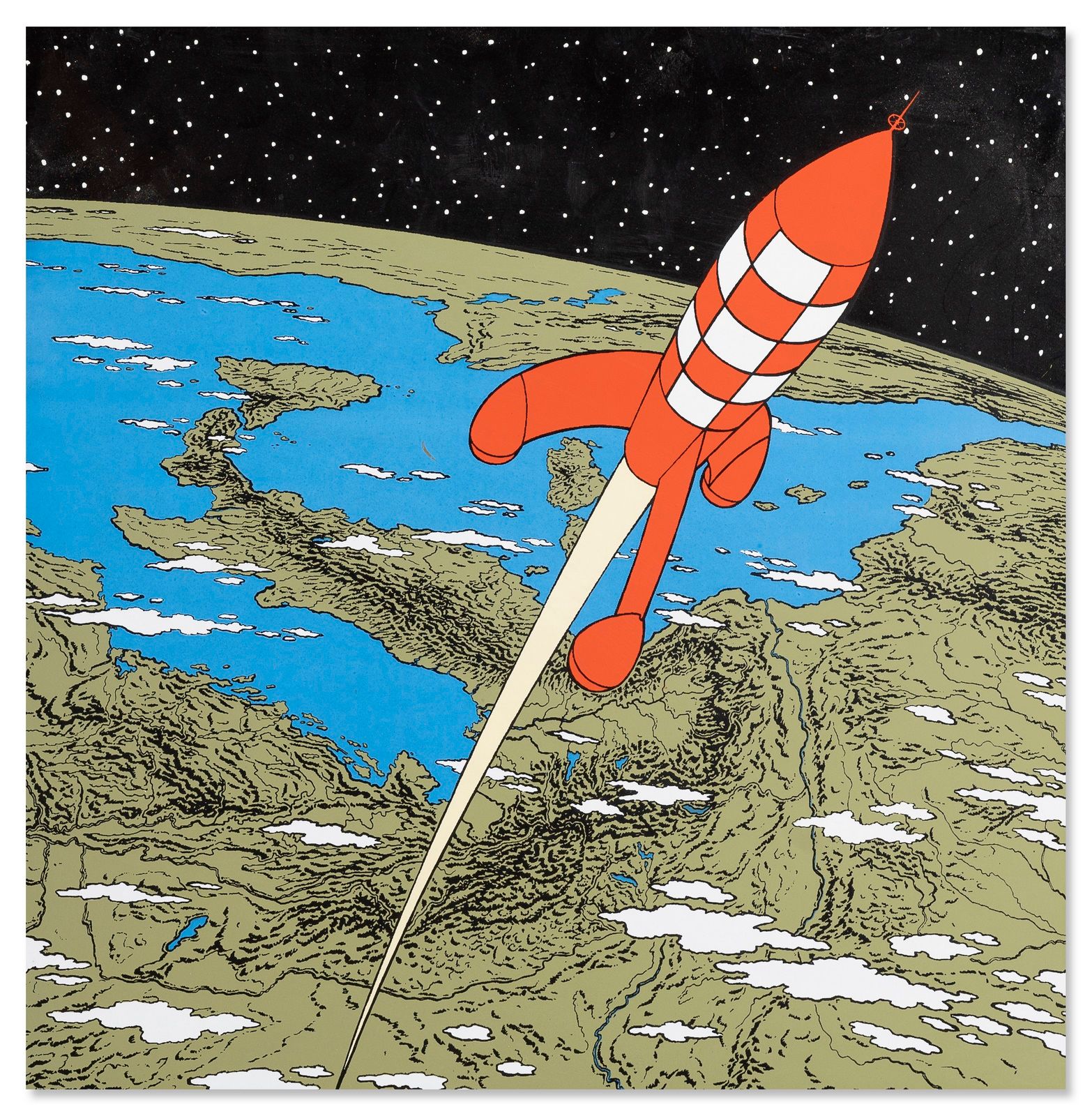
The icons symbolizing the contents of all pages in this site as well as in the landing page are all SVG vector artworks with characters from TinTin comic books. The landing page design was inspired from "4 options vector created by rorozoa". Even though nearly the whole original design was a good fit, it was slightly redesigned, some new options were created and a new item was designed from scratch by applying the same technique used in the original artwork. This exemplifies the versatility of vector graphics, allowing to reuse existing vector artworks, and to redesign, to modify, and to add brand new elements to them, while conserving the underlying style.